Inceptive Dashboard
A Centralized and Interactive online learning platform to help working parents better understand and spend time with their children.
Type: Group Client Project
Duration: 4 weeks (10/2019 - 11/2019)
Tools: Figma, Framer
My Role: User Research, Information Architecture, Prototyping, Hi-Fi Prototype, Usability Testing
Problem
Parents want the best for their child, but most of them aren’t experts and rely on their family, friends and (increasingly) the web for advice. Some of this advice, especially online, is irrelevant, biased or simply incorrect. Inceptive aims to eliminate this lack of trust and support that parents feel and make trusted information easily accessible, digestible and affordable. It supports working parents by providing expert-led live streaming workshops, recorded workshops, and community support.
Currently Inceptive uses Shopify's online store to sell their webinars and uses Zoom to conduct the webinars. Users need to switch between different platforms to access all the necessary information.
There is No Centralized Platform where parents can find and access live streaming workshops, recorded workshops, and ongoing support.
Final Design
My Workshops
Centralized page for parents to access all personalized information:
Upcoming live workshops,
Recorded workshop sessions and
Recommended workshops.
This keeps users engaged with the platform and increase the retention rate.
Video Watching
Preview the course syllabus
Skip irrelevant content
Bookmark the important content and review it later
Chat interactively with experts
Full screen size watching
Recommended workshops at the end of the session.
Discover
Using filter to explore different topics
Personalized “Discover” Page
View the outline of selected workshop
My Profile
Inceptive will make customized recommendations based on parents’ current stage and their interested topics.
Purchasing Transaction History to help manage all the purchased workshops
Provide “refer friends” to help achieve business objectives
Design Impact
On the Inceptive official website, it details my video interface design, which is used to show how the experts’ workshop can help parents get more authoritative and accurate parenting information anytime, anywhere.
In addition, on the Inceptive official website, it has taken our suggested dashboard approach to displaying all of a user's courses, including in-progress courses, completed courses, and more.
Design Process
User Research
Target User Groups
Working parents with young children or who are currently expecting
Already has an Inceptive account and has successfully purchased some workshops on the website
We conducted 5 in-depth user research with our target audience to understand their needs for online parenting information and their pain points for using Inceptive.
User Research Highlight
“I have to spend 5 minutes to find the link to workshop in email”
“I have to log in to different websites to access the information I need.”
User Research Insights
Competitive Analysis
Objectives
Through user research and competitive analysis, I have concluded the following user goals. At the same time, through communication with our client, we also confirmed the client's business goals.
Based on the above analysis and the “HMW” statement, we want to help working parents access the information they need more easily and accurately through a centralized learning platform and an interactive learning model.
Ideation
Information Architecture
Based on the current services that Inceptive provided, I reorganized the services and proposed a new information architecture for the single sign on dashboard. The dashboard contains 4 sections:
My Videos (the video/courses that users have)
Discover/Explore (explore and discover the new video)
Profile / Account Info
Forum / Community
Wireframe (Low Fidelity Sketch)
Based on information architecture, I sketched the design structure on each page
I confirmed the user flow with the client and also narrowed down the scope of my own part to user home page design, video watching page design, and new workshop discover page design.
Iterations
1: My Workshop Design Iteration
Iterations based on usability testing. Improve on Accessibility, Legibility, and Visual Design.
2: Discover Design
Redesigned the filter to provide quicker and easier access to information and reduce the learning curve.
Design System
Design Decisions
1. Centralized Platform
2. Foster Discovery
3. Interactive Learning
4. Judgement - Free Space
5. Catered to Working Moms & Dads
Final Design
Reflection
It's not easy being a working parent. I appreciate this opportunity to partner with Inceptive to help these working parents find the professional services they need more easily.
Through talking with clients to understand their business needs and with engineers to understand the technical challenges, I learned to design under constraints and prioritize design scope.
Design should not only consider aesthetics, but should also integrate business objectives, technological feasibility and user experience to achieve a balanced and outstanding design.
Future iterations:
Notes & Save Feature
Allows parents taking notes during the workshop and review those notes with the video content later
Calendar Sync
Sync live workshop with parents daily calendar, make parents easier to schedule live streaming workshops
UX Writing
Improve on UX writing to eliminate the ambiguity (make site information clear to new and returning users)
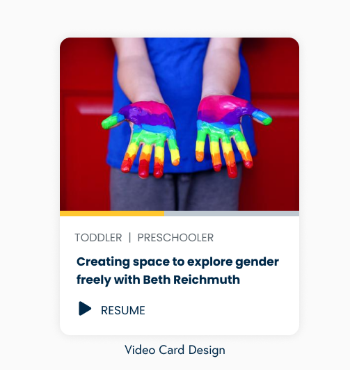
Video Card Design Iterations
What information is important to the users and needs to be displayed on the card design?
What is the best way to present information on the card?


